Design / WordPress / Custom theme / Performance optimisation / SEO / Copywriting
Enjin
Our own standards, made visible. A custom WordPress website where design, motion, content and performance are engineered together.
Visit website
The project
Engineering our own standard.
An engineering studio’s website should give people something more useful than a list of technologies. It should let them experience the care behind the work: the way a layout responds, the way a control behaves, the clarity of the content and the restraint of the implementation.
For Enjin, we shaped the positioning, design and copy around WordPress engineering for businesses, agencies and designers. Then we built a custom theme, a reusable ACF content model and a visual language of instruments, diagrams and precise movement. The same thinking extends from the homepage to the journal, project stories, enquiry form and WordPress login screens.
This is our own website, so we had the freedom to examine the small things. A menu that opens like a technical drawing. A portfolio image that is genuinely animated. Corners, calibration marks and controls that belong to one system. Each detail has a practical implementation behind it; this case study opens that up.
01 / Design with a purpose
Make the engineering part of the experience.
The brief was to express technical capability without making the site feel like software documentation. Confident typography and generous space do the communicating; fine instruments, orange accents and measured movement supply the personality.
Design is part of the delivery here. The positioning still leads with engineering: bringing a supplied concept to life, understanding the system behind a requirement and making the finished website behave properly.
Four principles behind the design.
A clear hierarchy
A shared heading scale, readable introductions and consistent labels give complex subject matter a recognisable order. The homepage has a deliberate display-scale exception.
A controlled palette
Ink, paper and accent colours come from shared settings. Light, medium and dark section themes create rhythm without inventing a new set of colours for each page.
A family of details
Outlined cogs, drafting instruments, registration corners and measurement rules connect navigation, project previews and editorial illustrations.
A reason to move
Motion reveals structure, indicates interaction or adds quiet character. The content remains the point of attention, with decorative artwork kept out of the reading order.
The design system supports page-specific personality through shared components and controlled variations. It does not require a separate collection of overrides for every page.
02 / WordPress beneath the surface
Give the content structure. Give the code boundaries.
A flexible website needs a clear division between what an editor controls and what a component guarantees. ACF describes the content and approved presentation choices. PHP renders the reusable sections. CSS establishes their shared visual rules. Small native JavaScript modules enhance specific interactions.
Projects are structured WordPress content, with their own scope, summary, imagery, outcomes and optional case-study chapters. Articles use native posts with additional editorial fields. The system can accommodate a concise project or a substantial technical story without duplicating a template.
Editorial content
Page sections, project details, article introductions, chapter labels, imagery and links.
Design settings
The shared palette, typography scale, layout width, spacing and approved illustration choices.
Content context
The current page, post or project determines which templates and supporting assets are needed.
- Pages with consistent section themes
- Portfolio cards and project stories
- Technical articles and navigation
- Responsive images and scoped assets
03 / A visual language built in code
Draw the idea. Then make it move.
The artwork is specific to the subject. Layered platforms suggest the stack beneath a WordPress website. Paired screens connect a designer’s concept to its implementation. Linked symbols represent the team. A conversation becomes a set of responding shapes.
These are native SVG illustrations rather than flattened images. Paths, circles, groups and shared colours give us direct control over the outlines and the parts that move. The four examples below are the same reusable illustrations used in the page heroes.
A shared drawing system, with individual character
The outlined brand mark is a continuous silhouette, avoiding the small seams that overlapping rotated shapes can produce. Drafting scales add degree markings, construction guides and a sweeping measuring arm. The Work entries use a mathematical drawing compass, with a hinged pencil arm, a needle, a calibration ring and fine orange details.
The components share colours and drawing conventions, while their movement and composition respond to their role. A wordmark needs a different visual weight from a large cropped hero illustration.
Motion at the level of the mechanism
We animate individual groups where that makes visual sense: a platform lifts, a measuring arm sweeps, a pencil adjusts its angle. CSS transforms keep that movement separate from the surrounding document layout.
Browser testing matters even with small animations. During development, the testimonial treatment was revised to animate an HTML wrapper around a static SVG after stepped movement was reported in Firefox. The visual intention stayed the same; the rendering approach changed.
A portfolio image that is actually alive
The Enjin preview combines a lossless WebP capture of the real homepage with the original animated SVG instruments placed at measured coordinates. The screenshot and instruments scale together, including the small mark beside the logo.
It is one self-contained SVG image: no embedded copy of WordPress, no video player and no external animation library. The rotating cogs and sweeping arms are real vector artwork. A conventional static image remains available for sharing metadata and as the configured fallback.
The animated homepage preview is 57,717 bytes, approximately 58 KB, before HTTP compression. This is the size of the specific asset created on 16 September 2026, not the total page weight or a page-speed score.
04 / The details people feel
Small interactions. Properly thought through.
The mobile experience has its own composition. The menu fills the available screen beneath the header, opens through a stepped reveal and introduces numbered links over a softly rotating compass. The logo stays where it was. Close occupies the same position as Menu.
That visual sequence is only one part of the work. Scrolling, keyboard focus, viewport changes and the return to the underlying page all need to agree with it.
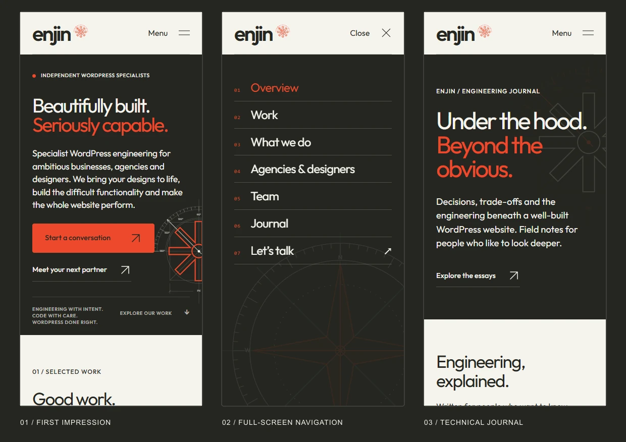
A full-screen menu that remembers where you were
While the menu is open, the page behind it is inert and page scrolling is locked. Keyboard focus stays within the header and navigation; Escape closes the menu and returns focus to the toggle. Closing restores the saved scroll position.
Short landscape viewports can scroll the menu itself. Returning to a desktop layout removes the mobile state. The compass animation pauses when the menu is closed, and the menu’s opening sequence respects the site’s reduced-motion handling.
A portfolio rail with more than one way through
The project rail uses native horizontal scrolling and scroll snapping. Previous and next controls, touch scrolling and a persistent range control stay in sync. On wide screens, two complete cards are visible; narrower layouts retain a partial next card as a cue.
The lower control has its own styled track and explicit arrow buttons, so its visibility does not depend on Firefox or Chrome choosing to display an operating-system scrollbar. Keyboard users can advance through projects or jump to the beginning and end. Without JavaScript, the native scrollable rail remains available.
Navigation that follows the story
Long case studies have a chapter menu that sits beneath the main header. Its active state follows the section being read, and anchor clearance accounts for the actual height of the sticky elements.
Project cards combine imagery, scope and context in a continuous frame. Fine registration corners and a moving measurement marker connect them to the illustration system, while a shared link treatment makes the next action recognisable.
Accessibility in the implementation details
The build uses native links, buttons, disclosure elements and labelled form controls. Decorative SVGs are hidden from assistive technology. Focus indicators remain visible, and controls expose their expanded, disabled or active states where relevant.
Keyboard behaviour, responsive layout and interaction states are checked together. A visually convincing control still needs to communicate its purpose and behave predictably when someone uses a different way of navigating.
The mobile menu was checked in Chrome and Firefox, including unchanged header coordinates, closing behaviour and scroll restoration. Additional layout checks covered narrow portrait screens and short landscape viewports.
05 / Performance by construction
Give the browser less unnecessary work.
Performance is a collection of decisions across the request, rendering and interaction paths. We looked at what each page actually uses, how imagery is delivered, where motion runs and which responsibilities belong to the theme or to an established plugin.
The result combines a custom presentation layer with premium hosting from Serversaurus. Hosting provides the environment; the implementation still has to make sensible use of it.
Load supporting assets in the context that needs them
The theme conditionally loads journal styles for editorial views, journal interaction code for individual articles, and case-study styles for projects with chapters. Contact resources are discovered from visible ACF contact sections; their Gravity Forms assets are enqueued where the form is actually present.
The theme also removes the standard block-style bundles it does not use. This is a decision about this implementation’s templates, not a general recommendation to dequeue WordPress styles without checking what renders on the page.
Use real responsive image sizes
Portfolio screenshots have WebP derivatives at widths suited to their placements. Their sizes descriptions account for the container width, card insets, alternating Work layout and two-card desktop rail. WordPress can then offer the browser an appropriate candidate through srcset.
Below-the-fold imagery uses native lazy loading. A project’s lead image is requested eagerly with high fetch priority. Image dimensions and container aspect ratios establish space before the asset finishes loading.
Keep animation assets small and specific
The hero diagrams are inline vector geometry, coloured through shared tokens and animated with CSS. The interaction layer uses native browser APIs for the menu, project rail and active case-study chapter. There is no separate slider or animation plugin powering those components.
The animated Enjin screenshot illustrates the same principle. Its 57,717-byte file contains its raster base and moving vectors, with no additional asset requests required to render the image. That measured file size says something useful about this technique without pretending to be a whole-site benchmark.
Maintain the code that is actually in use
Replaced theme styles, scripts and PHP implementations were removed from the active child theme rather than left beneath newer overrides. Reusable helpers keep the project imagery, decorative framing and illustration families consistent across their different placements.
Database hygiene receives the same attention to ownership. A read-only options audit identified entries for review; deciding what is safe to remove requires tracing their consumers and retaining an appropriate recovery path.
Measure the thing you are trying to improve
File weight, request count, rendering behaviour and user-perceived responsiveness describe different parts of performance. A small file does not automatically mean a fast interaction, just as an attractive laboratory score does not explain every visitor’s experience.
We distinguish an asset measurement from a page-load test and examine the context behind a result: the URL, device, connection, cache state and third-party services. That keeps optimisation focused on the actual work being done.
Asset measurements refer to the implementation checked on 16 September 2026. The animated preview’s file size is measured before HTTP compression; it is not a whole-page load-time measurement.
06 / Built to keep communicating
A website with something to say after launch.
The journal gives technical ideas room to develop. Articles explore resource delivery, personalised WordPress performance, integration architecture and the reasoning behind maintainable code. A plain-language introduction establishes the principle before the technical detail begins.
The publishing experience uses native WordPress posts, with ACF fields for presentation and editorial context. Project stories use their own chapter structure, so a complex engineering engagement can be explained through diagrams, screenshots, carefully scoped measurements and practical detail.
A reading interface for technical depth
Articles can include structured headings, an on-page contents list, language-labelled code blocks and copy controls. Wide code and diagrams have their own scrolling behaviour instead of forcing the whole page sideways. The journal’s diagrams share the site’s SVG language.
These details matter when an article needs to explain an implementation rather than simply introduce a service. Readers should be able to find a section, inspect an example and keep their place.
SEO metadata with a single owner
Yoast manages the page title, meta description and canonical metadata. Retired ACF metadata fields and duplicate hardcoded output are kept out of the active templates.
When content is created programmatically, its Yoast indexable is refreshed and the rendered head is checked. The aim is clear ownership and correct output, not two different systems both trying to describe the same page.
An enquiry experience that belongs to the site
Gravity Forms handles submissions, notifications and confirmations. The theme supplies the visual integration, including radio choices, field spacing, focus states and button treatment.
Using an established form system for that workflow leaves the custom code focused on presentation and context-aware resource loading. The WordPress login and password-reset screens also carry the same visual identity, extending the system beyond the public marketing pages.
Page sections, project content, case-study chapters, journal presentation and the shared design palette remain editable through WordPress and ACF.
07 / The finished experience
The detail is the demonstration.
Enjin’s website brings the design, implementation and explanation of our work into one place. Visitors can see the visual system, use the interactions and then read how the engineering was approached.
The same care applies when we are implementing somebody else’s design, extending a difficult WordPress system or investigating performance. Understand the requirement, choose the right mechanism and keep working through the details until the pieces agree.